 TC, BN, JBM, AZ
Multivariate problems
- In multivariate problems, exploratory analysis is paramount
- Is the data random or can we see patterns ?
- Can we visualize the data
- Can we discover subgroups amongst the variables or observations ?
One way to answer those questions it to use principal component analysis known as PCA.
- The main goal of a PCA analysis is to identify patterns in data
- PCA aims to detect the correlation between variables.
PCA can help us in discovering hidden patterns

- also to reduce high dimensionality problems,
- identify variables with highest variance
- compression
From univariate to multivariate problem
Univariate example
distribution of gene expression, distribution of human heights, distribution of length of sepals, distribution of drug response ...
# Generally, normally distributed (not always of course). Example of
# noramlly distributed data centered around 10 with variance equal to 1
y = 10 + randn(1000)
subplot(1,2,1); _ = boxplot(y)
subplot(1,2,2); _ = plot(y, "o"); grid(True)

bivariate example
x1 = 10 + randn(1000)
x2 = 10 + 0.2 * randn(1000)
data2 = np.vstack([x1, x2])
subplot(1,2,1);
boxplot([x1, x2]); grid(True)
subplot(1,2,2);
scatter(x1,x2); xlim([6,14]); ylim([6,14]); grid(True)

Multivariate example (3D)
from mpl_toolkits.mplot3d import Axes3D
x3 = 10 + 0.1 * randn(1000)
# Note that to combine 2D and 3D plots, you must use the add_subplot on
# a Figure instance
fig = figure()
ax = fig.add_subplot(1,2,1);
ax.boxplot([x1,x2,x3]); grid()
ax = fig.add_subplot(1,2,2, projection="3d");
ax.scatter(x1,x2, x3);
grid(True)

See the notebook called IRIS_3D_demo for an interactive DEMO
Higher dimensions
In 1, 2 or 3 dimensions, visual investigation is easy. We can quickly see whether variables are correlated or important. In higher dimensions, new tools are required.
How do we represent / visualize data in 4D, 5D, ND?
fig = plt.figure()
ax = fig.add_subplot(111, projection='3d')

x = np.hstack([np.random.standard_normal(100),
               20+np.random.normal(size=100)])
y = np.random.standard_normal(200)
z = np.random.standard_normal(200)
c = np.random.standard_normal(200)

ax.scatter(x, y, z, c=c, cmap=plt.hot(), s=80)
plt.show()

What about 5D, how would you represent it ?
PCA example in 2D
# Here we have 2 variables and N=100 samples
X = np.linspace(-6, 6, 100)
Y = 5 + 2*X + np.random.normal(size=100)
data = np.array([X,Y]).transpose()
plot(X, Y, "o", 0, 0, "xr"); grid(True)

The PCA analysis with sklearn
The PCA algorithm identifies the directions of maximum variance in high-dimensional data by combining attributes (principal components, or directions in the feature space) that account for the most variance in the data.
from sklearn.decomposition import PCA
original_data = data.copy()
pca = PCA()
pca.fit(original_data)
pca.explained_variance_
pca.explained_variance_ratio_
So 99% of the variance can be explained by the first component of the PCA analysis ! This makes sense since we know that X and Y are highly correlated.
Scaling the data
- Variables may be measured in different units
- Variable with larger variance is more likely to influence the PCA
- scaling is just centering and dividing by the standard deviation
from sklearn.decomposition import PCA
from sklearn.preprocessing import scale
data = scale(data)
pca = PCA()
pca.fit(data)
pca.explained_variance_ratio_
Note that when scaled, the explained_variance total variance is equal to the number of observations (here 2)
pca.explained_variance_
Transforming the data from original space to PCA space
the PCA analysis projects the data on new axis so as to minimize the variance
Xr = pca.transform(data)
plot(Xr[:,0], Xr[:,1], "ro")
grid()
xlabel("PC1", fontsize=20)
ylabel("PC2", fontsize=20)
axvline(0, lw=2); axhline(0, lw=2)

The PCA axis can be characterised by the explained variance and the components of the
pca.components_
components: Principal axes in feature space, representing the directions of maximum variance in the data. The components are sorted by
explained_variance_.
pca.explained_variance_ratio_
The PC vectors can be plotted back in the original space
#Xnew = pca.inverse_transform(Xr)
plot(data[:,0], data[:,1], "o");
count = 0
for length, vector in zip(pca.explained_variance_ratio_, pca.components_):
    v = vector * 3 * np.sqrt(length)
    plot([0,v[0]], [0,v[1]], "k", lw=2)
    text(v[0]+0.2, v[1]-.2, "PC%s" % (count+1), fontsize=16)
    count += 1
plt.axis('equal'); grid(); xlabel("X1"); ylabel("X2")

Compression (select first components)
pca = PCA(n_components=2)
pca.fit(data)
Xr = pca.transform(data)
Xnew = pca.inverse_transform(Xr)
plot(data[:,0], data[:,1], "o", label="original data");
plot(Xnew[:,0], Xnew[:,1], "rx", label="fit and transformed back")
legend()
grid()

If we use all PCA components (here 2 components) we can transform the data into the PCA space and back into the original space. We do not lose information.
Compression
When performing the PCA, we can restrict the number of components. In such case, when we transform back into the original space, we remove variance. In our example, it means we project the 2D data on a 1D space (the first PC direction).
Redo the previous example setting the number of components to 1 instead of 2. What do you see ?
pca = PCA(n_components=1)
pca.fit(data)
Xr = pca.transform(data)
Xnew = pca.inverse_transform(Xr)
plot(data[:,0], data[:,1], "o");
plot(Xnew[:,0], Xnew[:,1], "r-x")
grid()

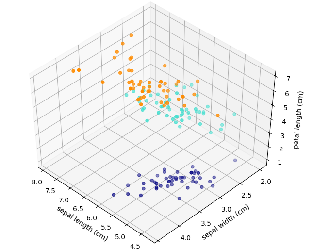
IRIS examples (4 variables)
The problem: measurements of 4 variables on 3 types of iris flowers. Are those variables pertinent ? Do we need all of them. Which one(s) can be used to classify the 3 species ?
| versicolor | virginica | setosa |
 |
 |
 |
import pandas as pd
from sklearn.datasets import load_iris
iris = load_iris()

df = pd.DataFrame(iris['data'], columns=iris['feature_names'])
colors = {0:"navy", 1:"turquoise", 2:"darkorange"}
df["target"] = iris['target']
df['color'] = df.target.apply(lambda x:colors[x])
df['target_names'] = df.target.apply(lambda x: iris['target_names'][x])
features = df.columns[0:4]
Explore the iris data sets
df[features].hist()

df.sample(10)
See IRIS_3D_demo
The PCA analysis on the IRIS data
PCA on IRIS data
- Using the IRIS data (without the label), perform a PCA analysis
- plot the explained variance ratio values and the cumulative sum of the explained variance ratio.
from sklearn import decomposition
from sklearn.preprocessing import scale

pca = decomposition.PCA(n_components=4)

X = df[features].copy()
X = scale(X)

pca.fit(X)
pca.explained_variance_ratio_
plot(pca.explained_variance_ratio_, "-o", label="explained variance")
plot(cumsum(pca.explained_variance_ratio_), "o-",
     label="cumulative variance")
legend()
grid()

Xr = pca.transform(X)
scatter(Xr[:,0], Xr[:,1], color=df.color.values)
xlabel("PC1");
ylabel("PC2");
grid()

What is the impact of a constant feature
Impact of dummy variable
- add a column to the IRIS dataframe with a constant feature (e.g. 10)
- Fit a PCA on the 5 features
- checkout the explained variance ratio
pca = decomposition.PCA(n_components=5)
subdf['noise'] = [10] * 150
pca.fit(scale(subdf))
pca.explained_variance_ratio_
By the way, how does it work ?
The eigenvectors and eigenvalues of a covariance (or correlation) matrix represent the "core" of a PCA:
The eigenvectors (principal components) determine the directions of the new feature space
The eigenvalues determine their magnitude (explain the variance of the data along the new feature axes).
X = df[features].copy()
X = scale(X)
U, S, V = np.linalg.svd(X.T)
-U.T
# eigenvalues
S**2/sum(S**2)
Summary
- PCA can be used to reduce high dimensional data sets
- Can be used for classification to separate classes
- cumulative variance can be used to set the fraction of variance to be captured.
Restrictions:
- we assume the biological question is related to the highest variances. Not robust for strongly non gaussian processes
- orthogonality constraints --> ICA
- PCA adapted for continuous data only
- If not, need to study link between qualitative variables such as correpondence factor (2 variables) analysis of multiple factor analysis (more than 2)
LCA
Linear Discriminant Analysis (LDA) tries to identify attributes that account for the most variance between classes. In particular, LDA, in contrast to PCA, is a supervised method, using known class labels.
from sklearn.discriminant_analysis import LinearDiscriminantAnalysis

X = df[features].copy()
X = scale(X)
y = df.target.copy()

pca = PCA(n_components=2)
X_r = pca.fit(X).transform(X)

lda = LinearDiscriminantAnalysis(n_components=2)
X_r2 = lda.fit(X, y).transform(X)

# Percentage of variance explained for each components
print('explained variance ratio (first two components): %s'
      % str(pca.explained_variance_ratio_))
print('explained variance ratio (first two components): %s'
      % str(lda.explained_variance_ratio_))
NB: Number of components in LDA must be (< n_classes - 1). Here at most 2 (3 classes -1).
figure()
colors = ['navy', 'turquoise', 'darkorange']
for color, i, target_name in zip(colors, [0, 1, 2], iris.target_names):
    scatter(X_r2[y == i, 0], X_r2[y == i, 1], alpha=.8, color=color,
                label=target_name)
legend(loc='best',  scatterpoints=1, fontsize=16)
title('LDA of IRIS dataset')

ICA (Independent component analysis)
PCA is not robust against non gaussian data or non orthogonal data.
Instead, we can use ICA. Note, however, that ICA is not used for reducing dimensionality but for separating superimposed signals.
ICA is an algorithm that finds directions in the feature space corresponding to projections with high non-Gaussianity. These directions need not be orthogonal in the original feature space, but they are orthogonal in the whitened feature space, in which all directions correspond to the same variance.
The data
rng = np.random.RandomState(42)
S_true = rng.standard_t(1.5, size=(20000, 2))
S_true[:, 0] *= 2.
#S_true /= S_true.std()

#angle = np.pi/3
#A = np.array([[np.cos(angle), np.sin(angle)],[-np.sin(angle), np.cos(angle)]])
# Mix data
A = np.array([[1, 1], [0, 2]])  # Mixing matrix [new X = x+y; new Y = 2 y]
X = np.dot(S_true, A.T)         # Generate observations
#original data
subplot(1,2,1); plot_samples(S_true/S_true.std()); title("True observations")
subplot(1,2,2); plot_samples(X/X.std()); title("Mixed observations")

pca = PCA()
pca.fit(X)
S_pca = pca.transform(scale(X))
pca.explained_variance_ratio_
Symetric data set but PCA gives us a 75/25 ratio. Why not ?
from sklearn.decomposition import PCA, FastICA
ica = FastICA()
ica.fit(X)
S_ica = ica.transform(X)
# Since the ICA model does not include a noise term, for the model to be correct, whitening must be applied.
S_ica /= S_ica.std(axis=0)
plot_samples(X/X.std(), axis_list=[pca.components_.T, -ica.mixing_])
legend(['PCA', 'ICA'], loc='upper right', fontsize=16)

plot_samples(S_pca / np.std(S_pca, axis=0))
title("PCA recovered signals")

plot_samples(S_ica / np.std(S_ica))
title("ICA recovered signals")
