Motivation
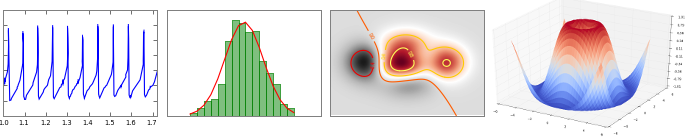
Matplotlib is a general 2D / 3D plotting library used in many Python scientific libraries. It is used in Pandas and Scikit-learn. Its syntax is quite consistent and allows one to create numerous high-quality figures
Resources: http://matplotlib.org/
Installation
conda install matplotlibConvention
import matplotlib
import matplotlib.pyplot as plt
# OR
import pylab
Using matplotlib
1. In the notebook, type this command to import all functionalities and include images in the notebook automatically:
%pylab inline
2. In a script or shell:
import pylab
3. In ipython, starts ipython as follows::
ipython --pylabNotes for fine tuning
import matplotlib
matplotlib.rcParams['figure.figsize'] = (10,7.5)
A toy data set using Bioservices and Pandas
A dataframe with drug/compound information
# pip install bioservices should work
from bioservices import ChEMBL
chembl = ChEMBL()
Ncomp = 10
res = chembl.get_compounds_by_chemblId(
    ['CHEMBL%s' % i for i in range(Ncomp)])
# some results are not found and tagged as 404 integer; let us remove them
res = [x for x in res if x != 404]
res[0]
# select compound to make things easier
res = [x['compound'] for x in res]
import pandas as pd
df = pd.DataFrame(res)
Obtaining compounds from ChEMBL takes time. In the example above, we look for only 10 compounds. However, you can find files in JSON and CSV files in ./data/chembl.json and ./data/chembl.csv with 5,000 compounds.
# In pure Python, JSON can be loaded as follows:
import json
data_dictionary = json.loads(open("data/chembl.json").read())
# With Pandas, you may use
import pandas as pd
df = pd.read_json("data/chembl.json")
df = pd.read_csv("data/chembl.csv")
df = df[["alogp", "molecularWeight"]]
df.dropna(0, inplace=True)
X, Y = df.alogp, df.molecularWeight
See ChEMBL notebook and Pandas notebook for more details about using Pandas
Quick way to get the sample data set
import numpy as np
data = np.loadtxt("data/sample_for_pylab.csv", delimiter=",")
X = data[:,0]
Y = data[:,1]
Some concepts and terminology
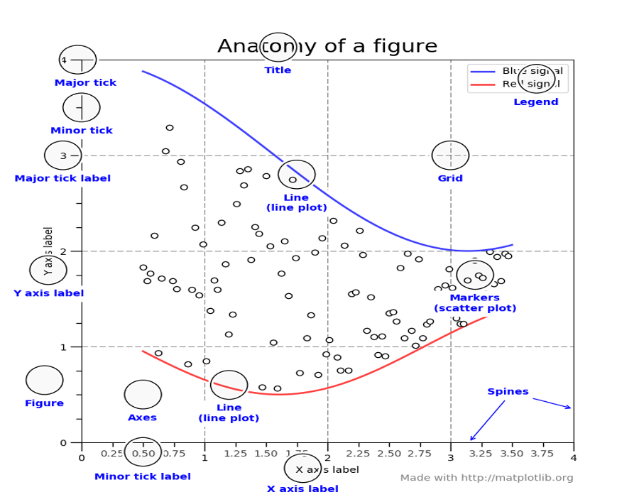
Concepts and terminology
Figure
The figure is like a canvas where all your Axes (plots) are drawn. A figure can contain several Axes. For now, we will use only one.
Axes
This is what you think of as ‘a plot’.
- The Axes contains two (or three in the case of 3D) Axis objects
- Each Axes has a title
- Each Axes can contain a legend
Axis
These are the number-line-like objects.
Labels
This is the "legend" of Axis. There are 2 labels for 2D plots the x_label and y_label.
Ticks
The ticks are the marks on the axis and ticklabels (strings labeling the ticks). There are two kind of ticks: major and minor ticks. By default they are automaticaly generated by the axis but they can be configured.
Coding Styles
Matplotlib has two coding styles:
- matlab style (functional)
plot(...)
xlabel(...)
title(...)
- vs object-oriented approach
fig = figure()
ax = fig.add_axes()
ax.plot(...)
ax.xlabel(...)
ax.title(...)
The two styles are perfectly valid and have their pros and cons.
Matplotlib by examples
The plot function (2 variables)
plot(X, Y)

# Let us make it nicer by providing a marker:
plot(X, Y, marker='o')

# let us also remove the lines
plot(X, Y, marker='o', linestyle='')

# an alias to the marker and linestyle is to use a third positional
# argument. Here b means blue color, o means circle marker and no
# third letter is provided for the style
plot(X, Y, 'bo')

look into the doc to figure out
- the color (e.g., k for black, r for red,...)
- the marker (e.g., o for circles, x for crosses, s for square)
- the line style (e.g., -- for lines, - for dashed lines)
plot(X, Y, color='red', marker='s', linewidth=0)

plot(X, Y, color="brown", marker="v", lw=0)

Plot function (1 variable) and the hold function
# You can provide just 1 variable as an input to the plot function:
plot(X, "b")

plot(X, "b")
# hold is True by default
plot(Y/20, "r")

plot(X, "b")
#hold(False)  # deprecated
clf()
plot(Y/20, "r")

xlabel and ylabel
# note that color may be provided as hexadecimal values
plot(X, Y, 'o', markersize=8, color='#ffaa11')
xlabel('alogp')
ylabel('molecularWeight')

# just an alias for later.
x = linspace(0,10,1000)
y1 = cos(4 * 3.14159 * x / 10)
y2 = 0.4*cos(8 * 3.14159 * x / 10)
plot(x, y1+y2)
xlabel('$Y(t) $', fontsize=16)
# Note r"" is for raw string to have more robust LaTeX code
_ = ylabel(r'$\sum_i^N Y(t)= \sum_i^N \cos{(\frac{\pi t )}{10} ) } $',
       fontsize=16)

grid function; markersize, fontsize, alpha parameters
# mec -> markeredgecolor
plot(X, Y, 'o', markersize=8, mec="k")
xlabel('alogp')
ylabel('molecularWeight')
grid(True)

# a bit more tuning on the grid and fontsize
plot(X, Y, 'o', markersize=8, alpha=0.5, mec="k")
xlabel('alogp', fontsize=20)
ylabel('molecularWeight',fontsize=25, color='red')
grid(color='r', linewidth=2, linestyle='--', alpha=0.5)

loglog, semilog
loglog(X, Y, 'or', alpha=0.5, markersize=8, mec="k")

semilogy(X, Y, 'y*', markersize=20, alpha=.5, mec="k")
grid() # works also with log scale

Histogram
hist(X, edgecolor="k")
grid()
_ = title('alogp')

x, y, z = hist(X, bins=30, normed=True, ec="k")
grid(alpha=0.5)
title('alogp')

x, y, z = hist(Y, bins=30, normed=True, alpha=0.5, ec="k")
x, y, z = hist(Y+200, bins=30, normed=True, alpha=0.5, ec="k")

x, y, z = hist([Y, Y+200], bins=30, normed=True)

plot a counter (dictionary)
Maybe you already know the values of the histogram (e.g., from a counter)
from bioservices import UniProt
u = UniProt()
fasta = u.get_fasta_sequence('P43403')
from collections import Counter
counter = Counter(fasta)
counter
How to represent this data ?
- values of the counter dictionary will be bars (y)
- x values should be from 1 to the number of keys
- labels of the bar on the x-axis should be replaced by the letter (key)
bar and xticks
# Let us get the values sorted alphabetically
values = []
for k in sorted(counter.keys()):
    values.append(counter[k])
# list comprehension:
# values = [counter[k] for k in sorted(counter.keys())]
values
#X and Y mus be provided
bar(values)
# we need values for X, let us use a range
xvalues = range(len(values))
bar(xvalues, values, ec="k")

# xticks() return current position and labels of the ticks
bar(xvalues, values, ec="k")
xt = xticks()
xt
# ticks can be redefined for each bar
bar(xvalues, values, ec="k")
_ = xticks([x for x in xvalues], sorted(counter.keys()), color='red')

Boxplot
# lambda is a quick way to write a function that add noise to an array
noisify = lambda X: X + 120*randn(len(X))
_ = boxplot([Y, noisify(Y), noisify(Y)])

xticks([1,2], ['alogp', 'molecularWeight'])

hum, here we called xticks and it created a new figure ? As you may already have noticed, in a notebook, different cells create different figures
_ = boxplot([X, Y])
_ = xticks([1,2], ['alogp', 'molecularWeight'], rotation=90)

_ = boxplot([X, Y, Y], vert=False)
_ = yticks([1,2,3], ['alogp', 'molecularWeight', "dummy"], fontsize=20)

_ = boxplot([X*50, Y, 100+Y, 200+Y], vert=False, patch_artist=True,
            notch=True)

results = boxplot([X*50, Y, 100+Y, 200+Y], vert=False, patch_artist=True,
            notch=True); grid()
# let us add a color in the range 0,1 as a function of the means
means= np.array([140.,350,450,550])
means-=140
means /= max(means)

from colormap import Color
c = Color("red")
for i, this in enumerate(means):
    c.rgb = (1,1-this,0)
    results['boxes'][i].set_facecolor(c.hex)

scatter plot
scatter(X, Y, s=50, alpha=0.5) # note that it is not markersize but s parameter
grid()

# let us create a third dimension (random value) for the size
# should be same length as X
Z = 300*abs(random.random(len(X)))
# color could be distance to the center
C = sqrt( ((X-X.mean())/X.mean())**2 + ((Y - Y.mean())/Y.mean())**2 )
scatter((X-X.mean())/X.mean(), (Y-Y.mean())/Y.mean(), s=Z, alpha=0.5, c=C, edgecolors="k")
grid(False); cb = colorbar()
cb.solids.set_edgecolor("face")  # better rendering of colorbar

color map
scatter(X, Y, s=Z, alpha=0.5, c=C, cmap='jet', edgecolors="k")
grid(); cb=colorbar()
cb.solids.set_edgecolor("face")

Scatter plot in a polar plane
# Compute areas and colors
N = 150
r = 2 * np.random.rand(N)
theta = 2 * np.pi * np.random.rand(N)
area = 200 * r**2
colors = theta
# Here, we use subplot to return an axe so that projection can be used
ax = subplot(111, projection='polar')
c = ax.scatter(theta, r, c=colors, s=area, edgecolors="k")

Histogram in 2 dimensions
out = hist2d(X, Y, bins=40, cmap="YlOrRd")
set_labels()
colorbar()
# let us plot the data as well
#plot(X,Y, 'kx', alpha=0.05)

out = hist2d(X, Y, bins=40, cmap="YlOrRd")
set_labels()
colorbar()
# let us plot the data as well
plot(X,Y, 'kx', alpha=0.05)

legend
x, y, z = hist(Y , bins=20, color='blue', normed=True, cumulative=False,
               alpha=0.5, ec="k", label=r'$\alpha$')
x, y, z = hist(Y+400, bins=20, normed=True, color='red', cumulative=False,
               alpha=0.5, ec="k", label=r'$\alpha + 400$')

legend(fontsize=25, ncol=1);
grid()

Figure and axes
So far we always used one figure and one axes.
Remainder:
- Technically a figure is a window that pops up.
- A figure can contain one or more axes
- So far, each time we've called a matplotlib plotting function (e.g., plot, hist, scatter), a figure was automatically created and then an axes was automatically created.
- axes and figure can be tuned. For instance, the axes that contains an histogram can be completed with xlabels, title and so on.
fig, ax = subplots(2, 2)  # a figure with a 2x2 grid of Axes
ax[0,0].plot([1,2,3], [1,5,3], "o-")

Subplots provide a quick way to create several axes at the same time. However, axes can create any kind of axes including overlapping axes.
fig = figure(figsize=(10,6), facecolor='#CCCCCC', frameon=True)
ax1 = fig.add_axes([0.1,0.2,0.35,0.4])
ax1.scatter(X, Y, edgecolors="k")
ax2 = fig.add_axes([0.5,0.5,0.35,0.4])
_ = ax2.hist(X, edgecolor="k")
ax2.set_title("histogram")
ax1.set_xlabel('example')

from biokit import viz
_ = viz.scatter.ScatterHist(X, Y).plot()

subplots
subplot(2,1,1)
_ = hist(X, ec="k")
subplot(2,1,2)
_ = hist(Y, ec="k")

xlim, ylim, axvline, axhline
hist(randn(100000), ec="k", normed=True, bins=20)
xlim([-5,5])
ylim([0, 0.6])
axvline(0, lw=2, color="r", ls="--")
axhline(0.15, lw=2, color="r", ls="--")

Patches: Example from matplotlib
from matplotlib.patches import Ellipse
NUM = 250

ells = [Ellipse(xy=rand(2)*10, width=rand(), height=rand(),
                angle=rand()*360) for i in range(NUM)]

fig = figure(); ax = fig.add_subplot(111, aspect='equal')
for e in ells:
    e.set_edgecolor("black")
    e.set_clip_box(ax.bbox)
    e.set_alpha(rand())
    e.set_facecolor(rand(3))
    ax.add_artist(e)
ax.set_xlim(0, 10); ax.set_ylim(0, 10)

Conclusions
We've seen
- plot, hist, scatter, hist2d, semilogx, semilogy, loglog , colorbar, plotting functions
- axes and figure notions
- colormap
- xticks, xlabels, ylabels, title
- patches (Ellipse)
- xlim, ylim, axhline, axvline
- tunable parameters: alpha, fontsize, marker, markersize
There are many more functions. Of interest:
- meshgrid, griddata
- 3D plots
- quiver
- pcolor (see exercises)
- imshow (see exercises)
Matplotlib practical session
- Explore the matplotlib gallery
- Create a 50x50 array (random values). Let us denote it A. Set the value on first row, first column to a value significantly larger. Plot the array using imshow, then pcolor. What are the differences ?
- Create the following image:
N = 100
x = np.linspace(-3.0, 3.0, N)
y = np.linspace(-2.0, 2.0, N)
XX, YY = np.meshgrid(x, y)
def f(X, Y):
    return (1-X/2+X**5+Y**3) * np.exp(-X**2-Y**2)
    #R = np.sqrt(X**2 + Y**2)
    #return sin(R)
contourf(XX, YY, f(XX, YY), 8, cmap="viridis");#, locator=ticker.LogLocator(), cmap=cm.PuBu_r)
contour(XX, YY, f(XX, YY), 8 , colors="black", linewidths=2)

data = np.random.randn(30,30)
data[0, 0] = 10
subplot(1,2,1); imshow(data)
subplot(1,2,2); pcolor(data)

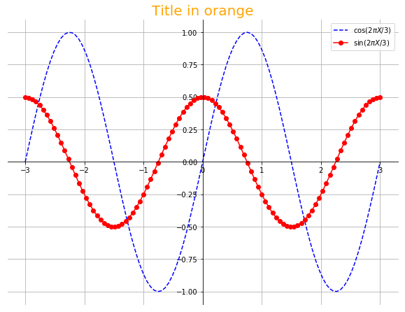
X = linspace(-3,3,100)
Y1 = sin(2*pi*X/3.)
Y2 = 0.5*cos(2*pi*X/3.)
plot(X, Y1, "b--", label=r"$\cos{(2\pi X/3)}$")
plot(X, Y2, "r-o", label=r"$\sin{(2\pi X/3)}$")
legend(loc="upper right")
ax = gca()
ax.spines['right'].set_color('none')
ax.spines['top'].set_color('none')
ax.spines['left'].set_position(("data", 0))
ax.spines['bottom'].set_position(("data", 0))
grid()
title("Title in orange", fontsize=20, color="orange")

References:
- matplotlib website
- scipy lectures notes
- pynxton notes